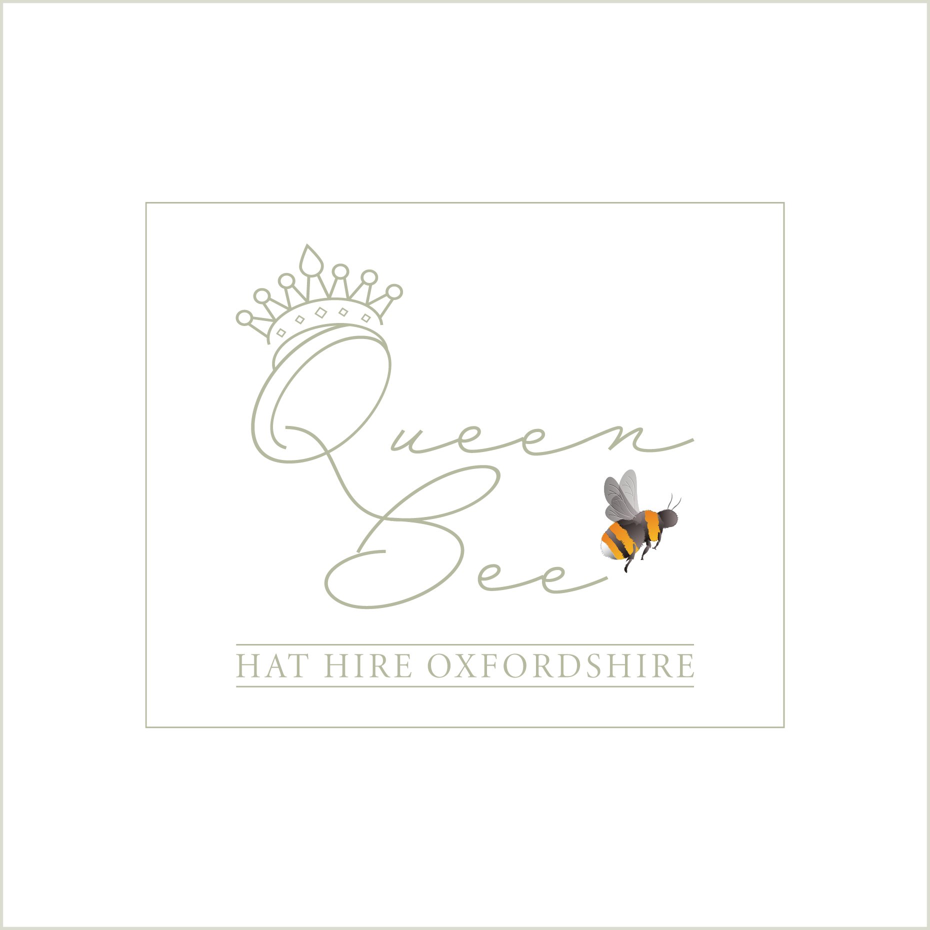
Queen Bee
When Laura, the new owner of Queen Bee Hat Hire, reached out to refresh her brand’s logo, she wasn’t looking for something corporate or conventional. She wanted something natural and personal - a design that reflected her own warmth and creativity as a new business owner. Something that would make Queen Bee Hat Hire feel approachable and authentic.
Laura had a vision: she wanted a bee with delicate, transparent wings, a crown (a playful nod to the name “Queen Bee”). The font was equally important; it needed a handwritten, approachable feel that echoed her own down-to-earth personality.
To bring her vision to life, I created a few logo concepts, each exploring different aspects of her brief. Laura loved certain details from each design, so we worked together to merge her favourite parts into a cohesive logo. After a couple of rounds of tweaks – chosing the right style for the bee, refining the crown, and perfecting the font style - we had a design that truly felt like her.
The result was a logo that felt like Queen Bee Hat Hire: unique, approachable, and with just the right royal touch.