Red Heron / Pandora’s HO,PE
When Elinor first began the Red Heron Social Movement, her focus was on building a supportive community for trauma survivors. With her energy directed at developing these crucial ideas, branding initially took a back seat. But as the movement grew and gained momentum, it was time to create a brand that would embody her mission and make her vision clear to the world.
In our conversations, Elinor’s dedication shone through. She was driven not only by her own journey but also by a genuine desire to help others navigate theirs. It became clear that Red Heron needed branding that would capture this compassion, warmth, and unwavering commitment to support.
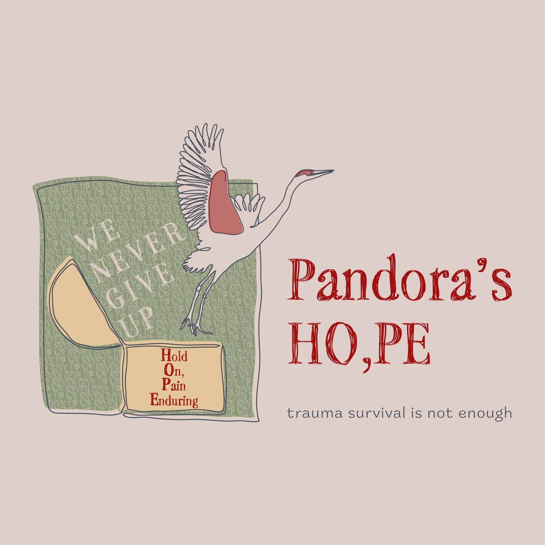
As Red Heron evolved, Elinor identified a need for specialized support within the workplace for trauma survivors. This insight led to the creation of Pandora’s HO,PE - a new branch of the movement focused on educating employers on how to foster supportive, growth-oriented environments for trauma survivors. While closely tied to Red Heron’s mission, Pandora’s HO,PE needed a unique identity that could stand alone yet still feel part of the Red Heron family.
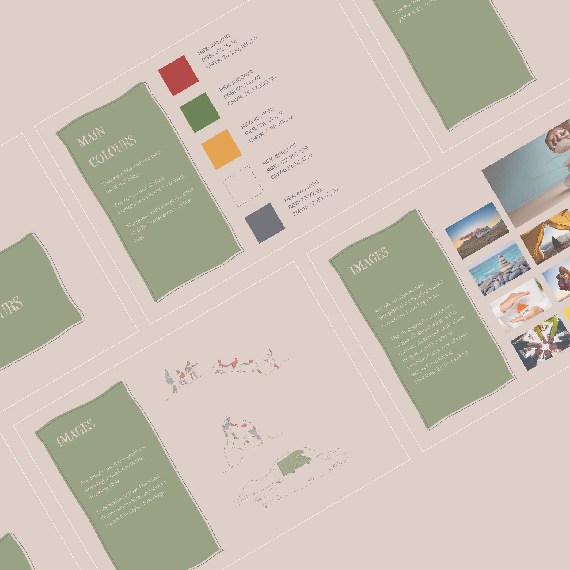
Working together, we developed branding that reflects both Red Heron’s compassionate ethos and the forward-thinking approach of Pandora’s HO,PE. Now, with a cohesive look and feel, both branches of the movement are ready to make an impact - helping individuals and workplaces grow, heal, and thrive.


Ellie
“Working with Claire was an absolute pleasure, she skilfully teased out the spirit of my rebranding needs and articulated my passion...”
“...for helping others create a life after trauma to live and love.
The initial drafts of my new logos absolutely blew me away and culminated with the final images bringing me to tears as they evoked the spirit of my passion :)
5*, will definitely engage Claire for future branding / design needs”

